With the user journeys mapped and MVP features defined, I moved into the design phase, starting with quick sketches, then evolving through low-fidelity wireframes, and finally high-fidelity prototypes.
The goal was to translate strategy into tangible screens that felt familiar, fluid, and full of purpose. Every step, from pen sketches to clickable prototypes, was guided by one question:
Before opening Figma, I explored multiple layout possibilities through fast, rough sketches.
Each sketch focused on simplifying navigation and reducing friction across the main user journeys for both listeners and preachers. After several variations, I brainstormed with the product manager, developers, and stakeholders to align on the most intuitive structure that balanced usability, simplicity, and feasibility.
This process shaped the foundation for the navigation and screen hierarchy we carried into wireframes..
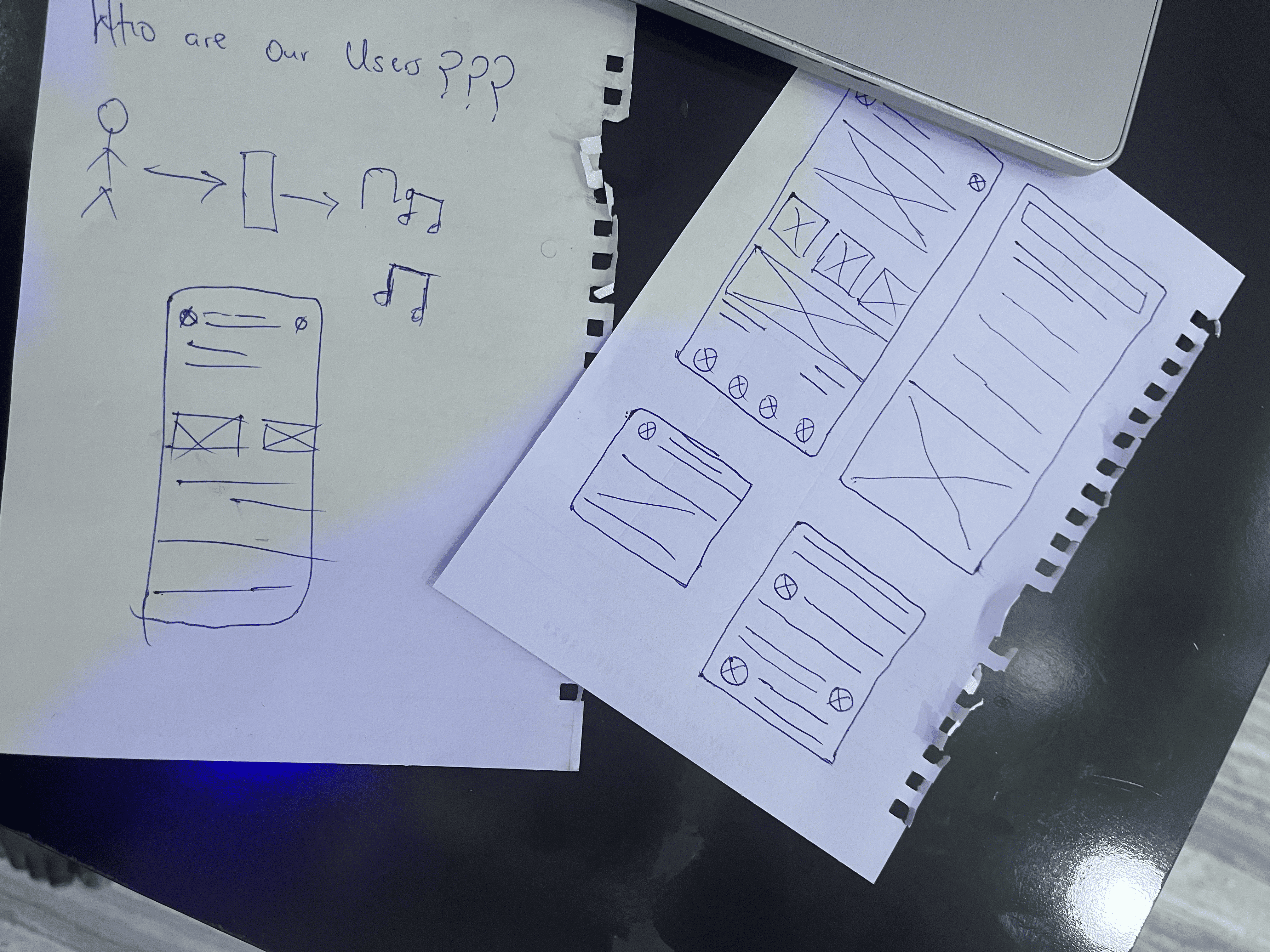
I began with low-fidelity wireframes to define structure, hierarchy, and interaction logic.
We ran early usability sessions to validate navigation flow and screen relationships before any visuals were added. One key takeaway: listeners preferred discovering messages by preachers first, then by themes.
This insight led to a home redesign that prioritized preachers while keeping themes easily accessible below. The wireframes then evolved into high-fidelity prototypes using Auto Layout for scalability and a smoother developer handoff.
With early insights integrated, I transitioned to high-fidelity design — focusing on clarity, warmth, and emotional balance.
Each key screen went through multiple review and testing rounds to ensure seamless interaction between both user roles. The final prototypes reflected real-world feedback gathered through usability sessions and informal interaction tests during design sprints.
Below is a walkthrough of Majeezy's key screens — designed to create a seamless, human-centered experience for both listeners and preachers.
The first touchpoint of Majeezy needed to feel welcoming.
I designed the sign-up & sign-in flow to be clean and minimal, collecting only what truly mattered — name, email, and password — so users could get started quickly.
After creating an account, users could personalize their experience by selecting gospel themes like Faith, Grace, Hope, Marriage, or Leadership.
This early personalization step wasn't just aesthetic — it shaped how the home feed and recommendations appeared later, making onboarding feel thoughtful and personal rather than just a formality.
The home experience was built to feel alive — a space where inspiration meets simplicity.
Listeners are welcomed with featured sermons, trending topics, and quick actions, while creators see instant options to start a livestream or upload a new message.
Cards are organized by Themes and Preachers, helping users explore without feeling overwhelmed.
The search experience complements this by letting users find exactly what they’re looking for — sermons, preachers, or topics, using a fast, forgiving search system.
Even if someone types “Fth” instead of “Faith,” Majeezy still understands what they mean. It's search made human — flexible, inclusive, and effortless.
For creators, sharing the Word had to feel just as simple as receiving it.
From the upload screen, preachers can upload audio from their device, extract sound from video, import from external links, or record fresh messages directly in-app.
I designed this experience to feel natural and guided — reducing friction and giving creators confidence that their message will reach the right audience.
The livestream experience is where Majeezy truly comes alive.
Creators can start or schedule livestreams in seconds, while listeners can tune in instantly, react in real time, and even set reminders for upcoming broadcasts.
Every element — from the soft gradients to the minimal overlays — was designed to keep attention on the message, not the interface.
The library is the quiet, personal side of Majeezy — a space for reflection and organization.
Listeners can save favorite sermons, create playlists, and download content for offline listening.
For creators, it expands to include Uploaded Messages and Recorded Sessions, neatly organized for easy management.
It's calm, structured, and intentionally simple — just like a personal spiritual journal.
The profile section brings it all together — identity, insight, and growth.
Listeners can edit their information and revisit saved playlists, while creators access a live dashboard showing how their messages are performing.
Analytics display plays, downloads, and audience demographics in clean, visual charts that make understanding engagement effortless.
I designed this section to feel less like data and more like encouragement — giving preachers clarity on how their words impact people across the world.


